Cuba:
Colour in interior design is difficult to get right, and easy to get wrong.
So, in most of our homes we tend to play safe.
Architects famously favour white, grey and black for a neutral, classic, modernistic and timeless look. They don’t want ‘colour’ to overwhelm the ‘architecture’.
In high-end luxury interior design is all white, beige, greige and taupe: colours that aren’t ‘colours’ as such, they are ‘neutrals’.
Neutrals may be innocuous and bland but they remain popular in serviced accommodation and hotels.
Of course, white is not ‘just’ white.
Paint brands offer ‘white’ in very subtle shades … onto blue… green…yellow.. grey. White can also be… brilliant, pure, soft, and cool, crisp, off and warm.

When colour is applied and used well it can be amazing.
It is playful, vibrant and energising.
But it can also be calming, soothing and gentle.
Making any colour choice is not straight forward. Even experienced designers working in interior design know how difficult it is to use.
And so we tend to live in a world where neutral tones dominate and conservative tastes win.
Then we go on holiday, and we see that it is not like that in other places.

In Cuba people love colour.

Colour is part of their lives and they are not afraid to use it.
There is colour is everywhere.
Cuban people love to use strong colours and mix bold, bright hues for maximum impact.

The local Cuban vernacular style thrives on colour and so people inhabit a world of every hue.
In Cuba, the sun shines a lot.
People experience their habitat in a strong and powerful contrast of light and shade.
And so colour is used for impact but also for softness and warmth.
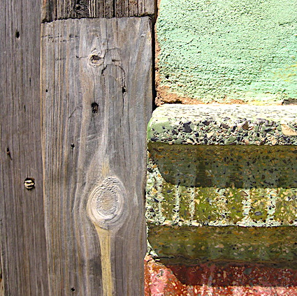
It is not just a bold brushstroke. Everywhere there is colour there is texture, pattern and style.

For colour-starved tourists Cuba is a unique experience.
Perhaps that is what shocks us most.
What is this world where zingy hues meet soft tones, where colours clash, and vibrate. Outside in the streets and on walls interiors, floors, ceilings, and furniture.
And magically, it works.

Against a backdrop of blue skies and strong direct sunlight the colours cannot be bright enough.

Colour in Cuba is more than just about creating pretty pictures or backdrops.
It is part of Cuban culture, identity, and pride.
Hot colours, cool colours, neutrals and earthy tones juxtaposed, blend, define and shape the space.
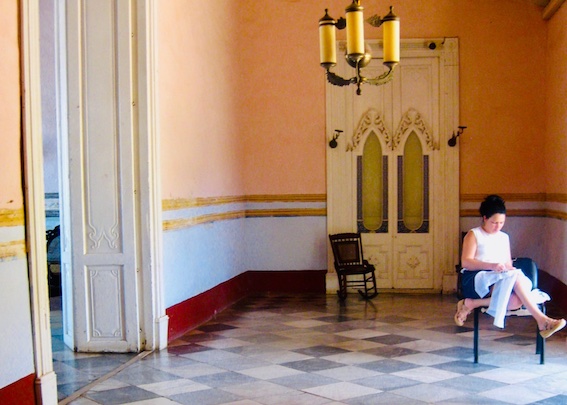
In Cuba the walls are often crumbling and old, the colours almost washed out of the texture. But this just adds another layer of richness and depth to what is already a truly visual and sensory experience.

In Cuba, they don’t hold back in their use of colour.
This is a country where the vegetation is so lush people are used to seeing bright natural colours in all tones and shades.
The buildings came later.
This is a world apart from bland conservative tastes, these are everyday sights we do not see at home.
In the UK, estate agents advise us to favour neutral tones in interior design.
If a space is decorated too vividly and too colourfully they worry that people cannot ‘see’ it properly.
Prospective buyers will be put off because they may lack the imagination to look beyond a busy décor to see it as their own.

And yet, rich colours can work very well in northern climates adding warmth and cosiness and character to our homes.
For some people using colour in interior design is what makes them happy, and makes their home feel good.


In northern Europe we do not experience the same quality of light. But also, we don’t have the same laid back temperament. Our planning laws are more restrictive and our tastes more conservative.
In Ireland, the exterior of homes beside the sea are often painted in pretty ice cream colours.
But in the city we tend to be more restrained.

The photographer Dave Jordano captures Cuba in all its intensity: a place where colour is everywhere.
From washed out greens to deep accent blues, colours layered and worn. There is the patina of age and the newly painted, fresh, sharp and vivid.
In buildings of faded grandeur and dilapidation colour makes even the dingiest places more habitable.
Cuban people are not wealthy and many live in accommodation that is basic, if not impoverished.
They may have very little in terms of comfort and possessions, but they do have colour – in abundance.

Painting may be a wall is a simple gesture.
But it can have a missive impact on space, people and place.